
I recently just finished a Risograph print! I love the way that it turned out and so far the response has been really good. I figured it might be nice to break down the start to finish process for folks that aren’t familiar.

you get the idea.
I started sketching in Procreate. This is a new setup for me (my sister gifted me her old iPad for Christmas since she doesn’t use it anymore) and I’ve really started to enjoy the freedom of being able to work away from my desk without having to worry about things like scanning, paper, erasers, lots of supplies etc. Digital drawing is something I’ve been doing for about 10 years now, and this is my first foray into working directly on a screen, the tablet I use is an Intuos 4 from 2009 so I’m finally kicking and dragging myself into the 21st century.
The sketch is rough but it gets the point across for what I need figured out first, which is pose and silhouette.
After the sketch layer I switch brushes to something closer to a pencil and start figuring out what everything is ACTUALLY going to look like.

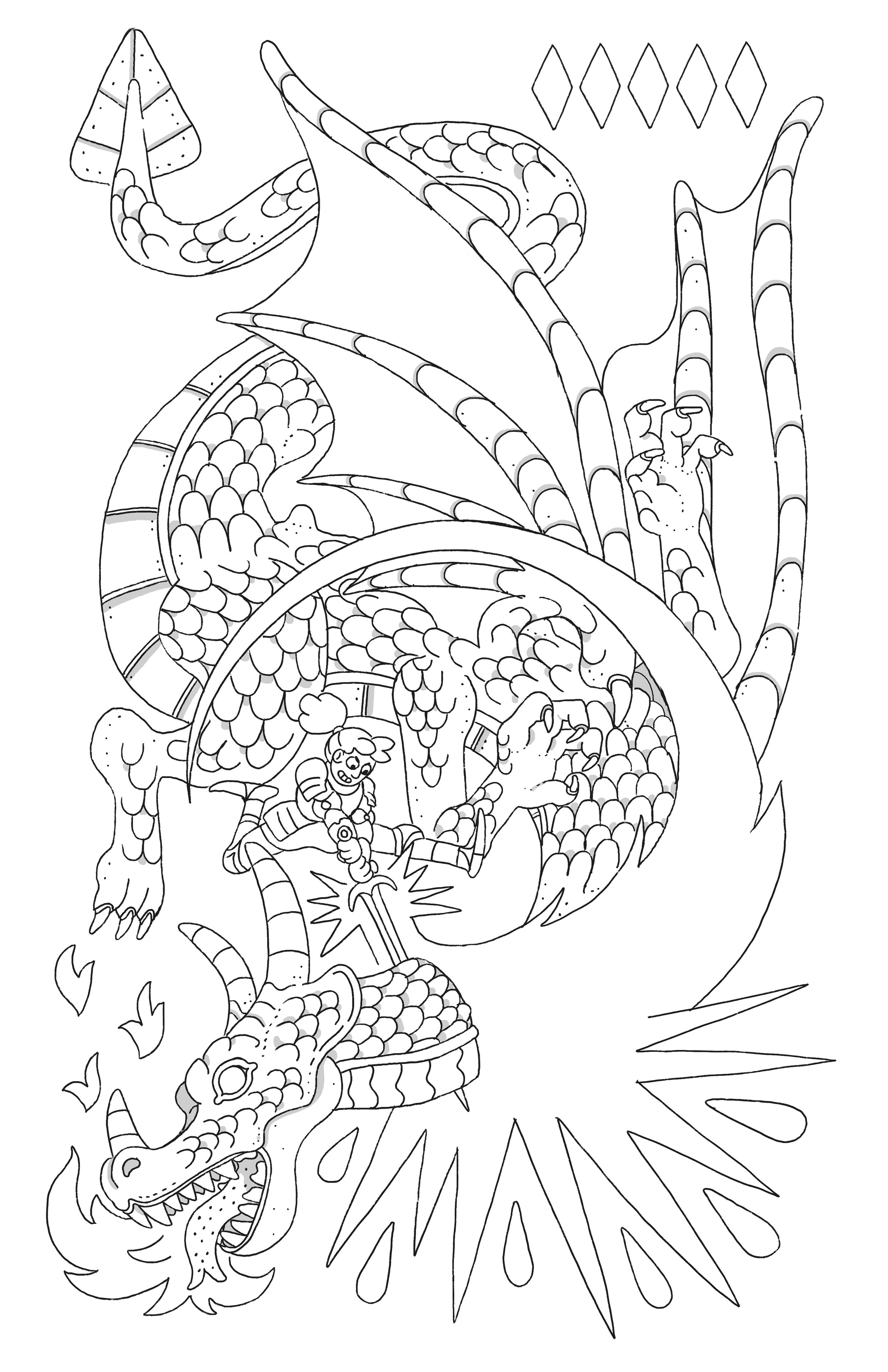
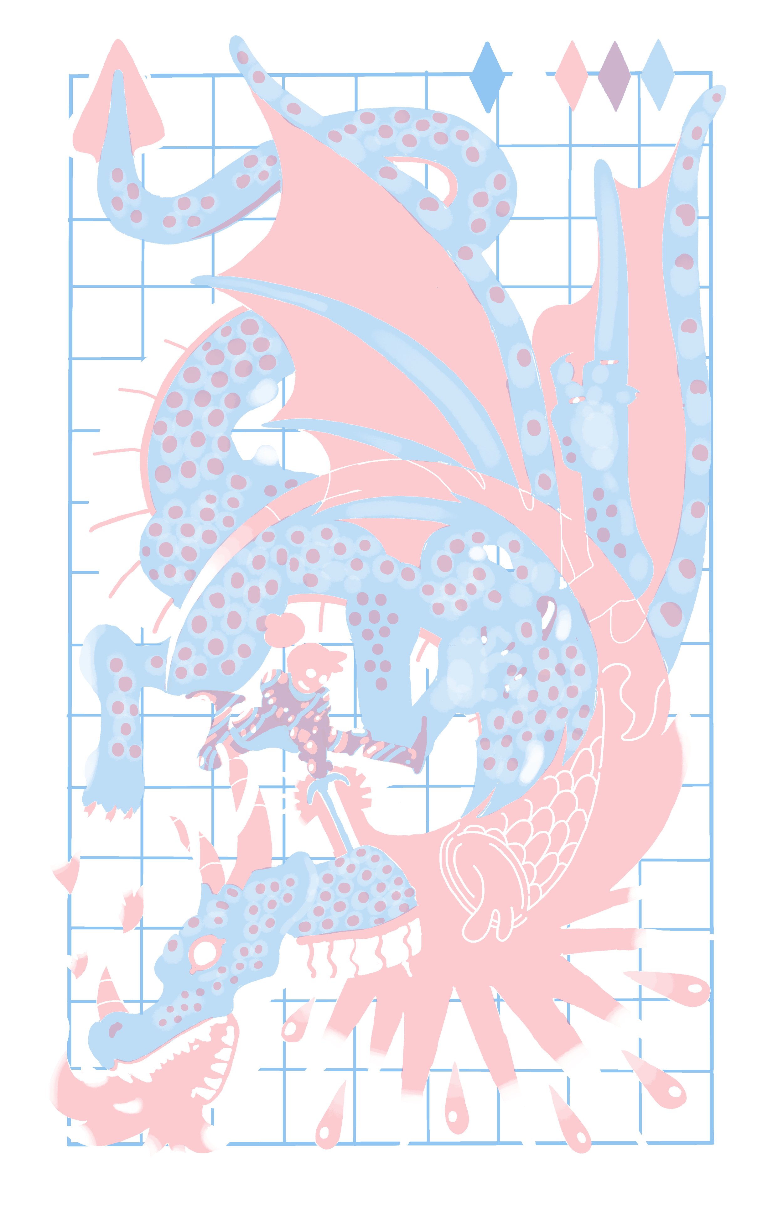
After the pencil lines are done I finalize everything with a ink layer. Normally this would be separate line/shadow layers but Risograph prints are color layer based. So everything that’s going to be black has to be on the same layer, and I just do the shadows at a different opacity to they look grey.
Colors are the next step! Risograph print shops each have a list of the colors that they use on their website, I love this, because working under a restricted palette builds character. Here were my choices at Lucky Risograph. I went with them because they are fairly close by and I had seen some artists I like use them before.

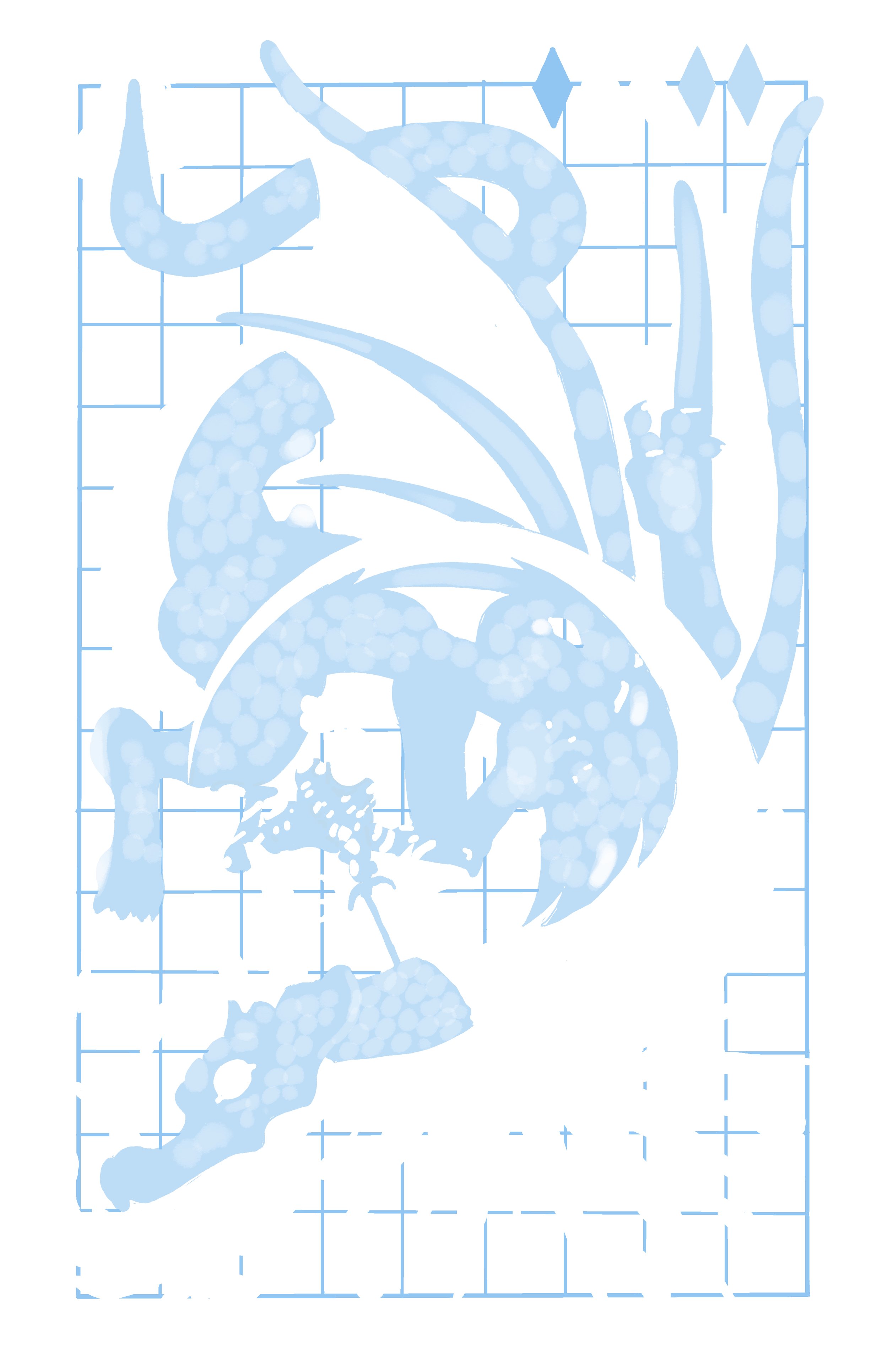
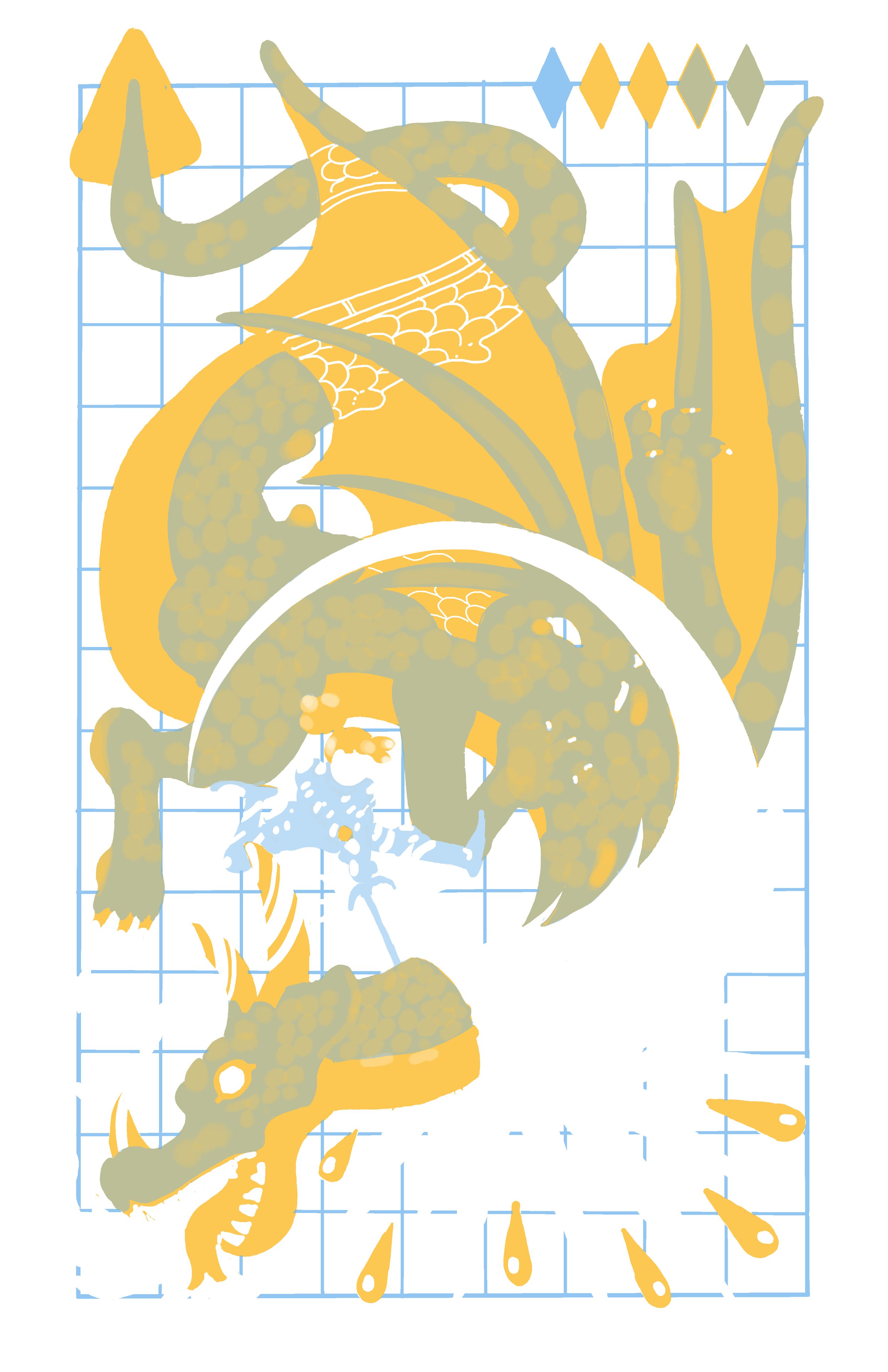
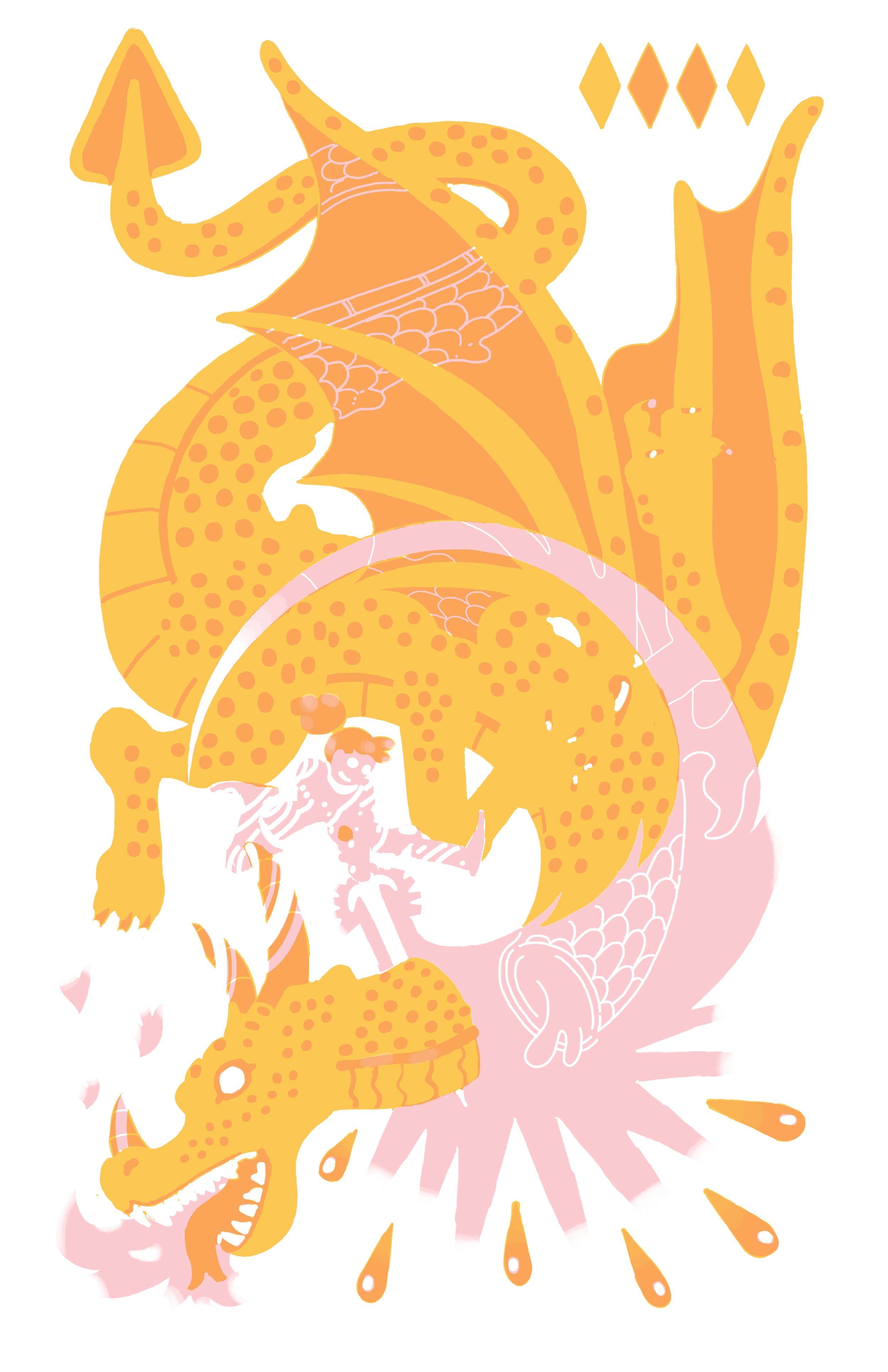
I’ve always been a big sucker for CMYK printing (which stands for Cyan, Magenta, Yellow & Key/Black) So I chose Black, Cornflower Blue, Sunflower Yellow & Bright Red. This gives me basically infinite flexibility in my palette through the use of opacity and color blending. Now I get to experiment with how everything looks for a while. I switch from the iPad and Procreate over to Clip Studio Paint on my PC and I start playing around with layers and opacity.
They don’t look like much without the black layer, but you can see a bit of how I got various color combos out of the yellow, blue & red.
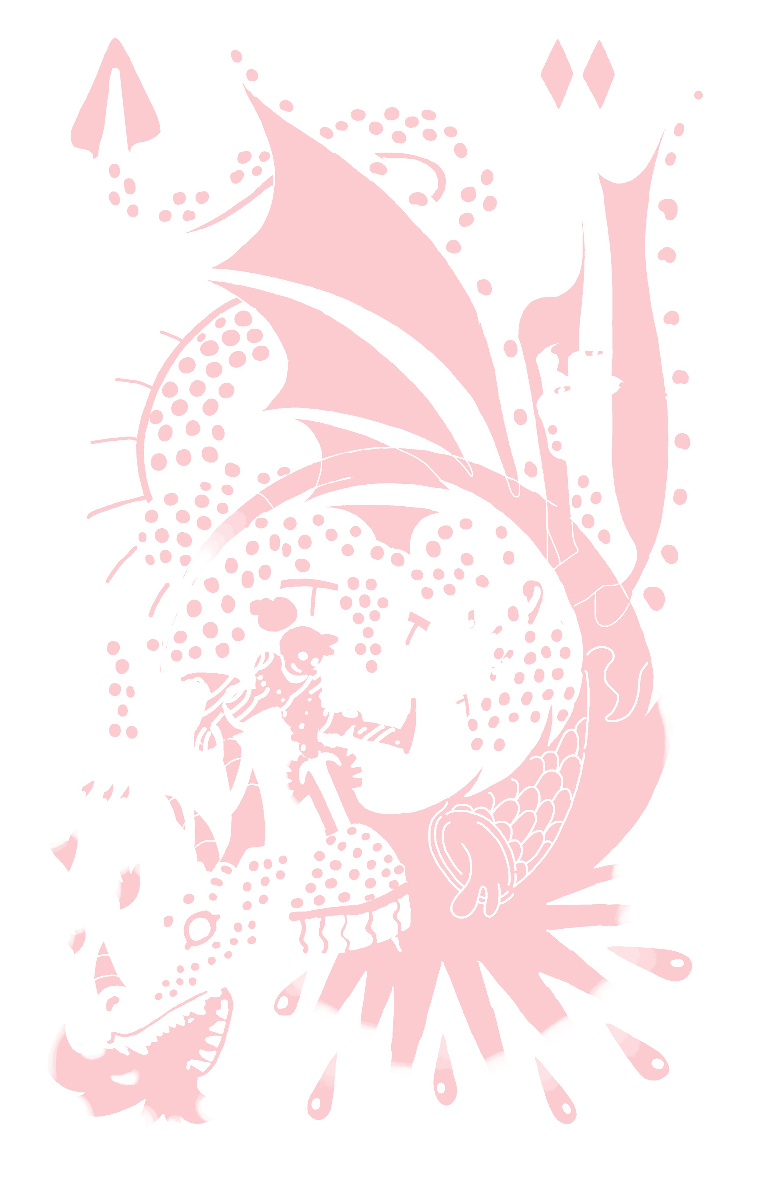
It’s important to keep your layers separate here. The file you send to your printer should have 1 layer per color used.


after that I email my file to the printer, get a quote for the print and pay! I decide the kind of paper I want it printed on based specifically on the fact that I need to roll these into a tube to mail them. We decide on 80lb Via Vellum in Bright White.
Then I play the nervous waiting game while I wait for them to tell me that the job is done and it’s on it’s way! They sent me this picture to make sure everything looks how I want it to, and it arrived a few days later!


