Against the Giants

Heya Folks,

I make an appearance over on Between Two Cairns this week, and we discuss the classic module AGAINST THE GIANTS. In tandem with this I decided to put together a zine of the sketches I make while reading these modules. So far I just have Issue G1 in digital form, but G2 and G3 are in layout and if folks like them I’ll do some print copies as well. Here’s a little sample! (quick note, if you’re a Patron you have a free download code for this waiting for you!)

Enjoy!

Isle of Dreading the Imminent Change of My Workflow

(jk it’s a good change)

I’ve been messing around in Procreate! I was lucky enough to inherit an iPad from my sister, who apparently had no use for it. Thanks kid!

I’m really, really, really enjoying the freedom that drawing on a tablet provides. I have been using the same Wacom intuos 4 for exactly 14 years now* and I have long been a curmudgeon about making any sort of change. If you developed a workflow on a screenless tablet you might understand how I feel. It is a steep learning curve to detach your eye from your hand like that- akin to doing gesture drawings at first. So when you develop a sturdy practice with it you might be hesitant to throw away those hard spent hours. 

* only a slight exaggeration as my original died 2 years ago and I replaced it with a used one of the same make and model.

I had briefly tried one of those exceedingly fancy Cintiqs that you see all the pros using, but either by virtue of my brief time spent with it (an archeologist friend lent me the one he had convinced the university to buy for him) I never warmed to the way it felt. Though it’s possible with some setting changes and not using Photoshop (cursed slow lumbering waste of money that it is) I would have found comfort in it.

Procreate is much more lightweight and the workflow of sitting curled up with a tablet is extremely cozy and a nice change of pace from sitting in an office chair all day. The program is lightweight enough that learning its quirks has been fairly easy and there are only a few aspects of it that annoy me. But mostly I just need to get used to looking at a reference image on my phone while I draw instead of having a second monitor to pull things up on.

That all being said I’ve been fiddling around with it a lot and forcing myself to do some non commission based work to stretch my legs in the new year. I started this piece as a quick sketch of a marching order of adventurers in a tunnel and it quickly evolved into a large scale poster sized piece set on an island. I was thinking about making it a bit of Isle of Dread fanart, but we’ll see how that goes. I’m flirting with the idea of making a series of old module “movie posters”- is that something people would like? I think I would like it. I tend to enjoy the ephemera of a lot of the old school stuff more than the content. Don’t get me wrong there’s some charm there, but much of it is badly laid out sub par writing hiding the barest nugget of a good idea. The spirit of the thing is what’s important, and there’s plenty of people full of it these days making much better stuff.

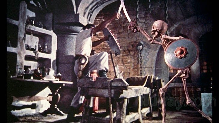
Isle of Dread is one that I haven’t read through the entirety of, despite having I think multiple copies do to a shipping mistake long ago. HOWEVER it reminds me of one of my favorite films of all time, The 7th Voyage of Sinbad, which is old school d&d down to its bones. And there are plenty of bones in it.

I like the idea of a big weird island full of stuff. I also like that the bad guy in 7th Voyage is a wizard with a captive dragon and there’s a big cyclops and they fight. 

My sketch is coming along nicely for it. I’m playing with some worldbuilding things that I have come to think of as canonically old school. One of them is befriending monsters to hang out with you, which is why that Ogre is carrying stuff. The other is the scale of Dwarves, which I like being actually not that small and instead they just have these big heads and otherwise strangely proportioned bodies. Also there is a cat because if someone asks to be a cat in a game of d&d you can just say yes to them and let them play Puss and Boots because who cares. Final will also most likely have a giant bird because the whole plot of the crew eats the baby Rocs and then the Roc eats them is some solid gold, A plus old school adventuring nonsense.

Here’s the poster sized version that I’m working on now.

So probably it will find it’s way to completion in the coming weeks. If you like it when I post things like that, and then explain them like this, you might consider subscribing to my Patreon. It REALLY helps to have a steady income for making art when you’re a scrappy freelancer living job to job. 

Anyhoo things for reading, more to come.

Kiss Kiss, 

Skullboy


Dungeon23

I love a big project. I rarely finish a big project, but I try not to let that stop me from trying again. Love Sean’s idea for Dungeon23, so I’m gonna give it a go. Got my stuff (love an excuse to by a slightly too fancy notebook) and there is a certain accountability in dropping 25 bucks on something that makes me wanna follow through.

DISCOVERY! At least half of those pens don’t work, I hadn’t tested them yet.

I think leading up to the first of January I’ll flesh out a bit of the castle that sits on top of the the dungeon, but I don’t want to jump the gun too much. I spent some time while I was out of the studio last week doing some hectic chart and table making. (in a different notebook, the new one hadn’t come yet) It all looks like the scribblings of a madman, but that’s kind of what this whole project is.

Here’s what those scribblings look like. I like showing off really ugly sketchbook pages sometimes. It reminds people that sketchbooks aren’t pretty places that are supposed to be curated for instagram. They are for the people that use them and everything else is bonus content, whether or not you use it for anything else is irrelevant. Anyways.

literally just the od&d dungeon creation but worse, near a slightly alphabetical list I copied from an excel document of “types of rooms” probably stolen but it said I made the excel doc so-

I’m leaning into a certain amount of random generation stuff for “biomes” and treating it a bit like the random seeds at the start of a new game of Valheim or Terraria. I like putting video games in my tabletop games, because its fun and it makes people mad.

I also like the idea of a dungeon having a few different biomes, a la depthcrawl/hexcrawl style. It’s fun.

I’m not gonna follow any of the rules I’m setting up for myself, this is gonna be a disaster.

working through wandering monster tables, fixing the things that are stupid, like how there are no severed demon hands.

I am currently writing something that probably will be thought of as a “fantasy heartbreaker” but the main focus of this game is going to be making monsters, spells and dungeon generation interesting and easy to do on the fly. It also is only going to be about dungeon crawling so this is a good project to do in tandem.

deciding what kobolds look like is really the only important thing. also, goblins are fairies.

we were honing on something here for sure. for the days I cant decide if I want spinning blades or acid jets.

part of this is just workshopping new monsters for a game system I’m making, so no one has to fight a spider in a dungeon ever again. Also, altars

Elementals are underserved in TTRPGs. THERE I SAID IT. I think there are cooler ways of doing things than just walking around piles of rocks okay.

I’m thinking that the rooms should be like, really hard to describe, shape wise. I like just giving players the map and uncovering as they go. I’ve never liked the specifics of describing a map.

monsters have pubes.